Logo and guidelines
Following the logo guidelines is crucial for maintaining consistency and professionalism, helping to ensure clear recognition and a strong visual presence.
Contact the communication department if you have questions on how to use the logo.
Placement and use
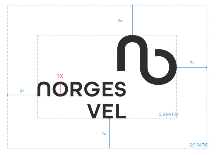
The logo must always be placed where it is clearly visible and readable, and in harmony with other elements. When applying the logo to surfaces, there must be a minimum of 2X clear space around the logo on all sides.
Note: The clear space rule does not apply to background images or background colors, but to objects on the same surface (such as text, images, graphics, illustrations, etc.)
Download Norges Vels main logo
As a general rule, the Norges Vel logo should be presented in BioSort or in negative (white) where necessary for readability. In some cases, a dark or light gray version may be used.
You can download Norges Vels main logo in four different colors at the bottom below. The files are in a zip format.
Clearspace around the logo

